top of page
Overview
UX DESIGN CAPSTONE PROJECT
Edusphere Web App
Roles
UX/UI, Visual Design
Tools
Sketch, Invision, Keynote
Timeframe
May - August 2019
OVERVIEW
Edusphere is an online web platform that focuses on improving student-teacher relationships and communication in and out of the classroom. By utilizing Edusphere’s online learning portal, teachers can consistently perform checks for understanding with immediate feedback and efficiently assess student work with the help of editing tools to mold each individual student’s learning experience.
ROLE
In the process of designing Edusphere, I was able to experience the full UX process and explore a wide variety of roles, from user research all the way to high-fidelity prototyping. Due to the nature of the online UX design course, this project was completed individually.
THE PROBLEM
Modern education highly values personalized learning and specialization when it comes to creating an effective learning environment, yet teachers often lack the time and tools to really understand and attend to each student’s needs. Teachers found that they had to spend an unnecessarily large chunk of time on grading, when instead, they would have liked to use that time to analyze student needs and cater their classroom material towards certain focus areas.
Research
USER RESEARCH
Initially, my goal was to design an education tool that aimed to assist teachers with grading and editing, since I've heard many complaints about how long and repetitive the grading process is. While brainstorming the idea, I researched popular apps that focused on editing, but I found that most educational apps focused on being able to calculate grades cumulatively, annotate on a digital surface, or automatically grade quantitative assessments. To get a better understanding of what problems teachers faced in the classroom, I sent out a screener survey to 20 teachers from local international high schools and education centers to find suitable participants for my user interviews.
Survey Insights
-
Creating a web-based platform for desktop would reach more teachers than a mobile app
-
Majority of teachers preferred receiving work online rather than a printed hard-copy
-
Teachers are very willing to utilize technology in the classroom


Key data findings from screener survey
Interviewing Potential Users
I then conducted 3 user interviews, where I gained insight on:
-
Types of features teachers looked for in education apps
-
Teaching methodologies they utilized
-
How they personalized the learning experience for students
-
How they use technology within the classroom
-
Obstacles that prevented them from fostering their ideal learning environment
After getting a clearer understanding of teachers’ needs, I realized that my project could be doing much more than simply providing teachers with editing tools, so my project shifted direction and became an online educational platform and learning management system for teachers to better achieve personalized learning in their classroom.
Evaluating Usability Heuristics and Performing Competitor Analyses
In order to gain a better sense of what was out there, I decided to evaluate other learning platforms based off 3 of Nielsen Norman's 10 Usability Heuristics, specifically Showbie, Google Classroom and Schoology, which were tools used within the school where I conducted user research. Here is the full document: Usability Heuristics Analysis
Synthesizing User Research
From the user interviews, I created an affinity map to summarize general insights, empathy maps to resonate with the thoughts and feelings of the target user, and two sample user personas to identify the specific target audience. These were then used to guide the design of the product.

Affinity map to categorize insights from user interviews


Empathy maps to understand main pain points and concerns


Sample user personas to gain a better understanding of target audience
Ideation
IDEATION
Problem Statements
-
How might we help teachers gain a better understanding of their students’ progress?
-
How might we make the grading and feedback process more efficient and accessible for both teachers and students?
-
How might we personalize the learning process without making students feel isolated?
-
How might we improve the student-teacher relationship and reduce misunderstandings?
-
How might we assist teachers with lesson planning and maximizing the use of class time?
-
How might we help students achieve their learning goals in a more efficient way?
Task Analysis
I then brainstormed features that can solve each problem statement to further organize ideas.

Information Architecture and Sitemap
Once I finalized the product features, I then created user stories to identify MVP priority features and established the overarching information architecture by building a sitemap.

User Flows
Using the site map as a basis, I then constructed user flows that demonstrated how users would be able to complete certain tasks with more specific detail.

Wireframes
WIREFRAMES
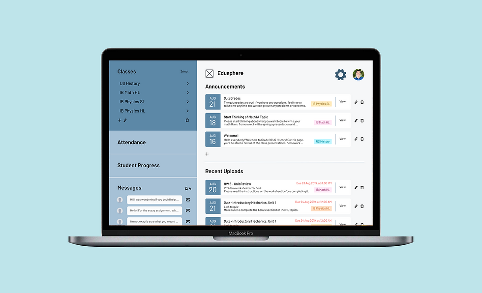
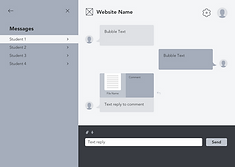
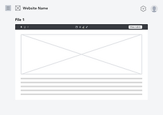
The next step was to start wireframing using Sketch to design the user interface of the web app. I started with medium-fidelity wireframes to focus on app structure. Key features to note:
MAIN NAVIGATION FOCUS AREAS


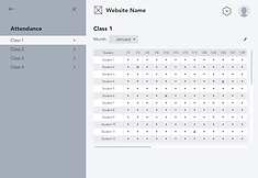
Home page, class page, and attendance: all easy access using sidebars
PERSONALIZED LEARNING FEATURES


Tracking student progress: grades and learning targets can be used to guide classroom material
Accessible communication both in and out of the classroom: chat messaging feature
NAVIGATION & MULTITASKING
FEATURES


Multiple sidebar views that can be hidden or opened allow for easy navigation and multitasking
Multitasking can be useful for: classroom presentations with interactive quizzes to stimulate lectures and gain immediate feedback or grading assignments with a rubric and comment bank
RESOURCES ALL IN ONE PLACE


A learning database all in one system: create, upload, edit or delete announcements, assignments, resources, and quizzes using simple-to-use popups
Iterations
PROTOTYPING AND TESTING
Before creating high-fidelity prototypes, I wanted to quickly test out my design to gain immediate feedback. Thus, I sketched out a simple paper prototype to use for guerrilla testing.
Paper Prototype

Guerrilla Testing
I was able to test my low-fidelity prototype on three people with varying levels of exposure to technology, so I could see which types of icons and language used for buttons were most easily understandable or confusing for different levels of tech users. By manually placing different screens on top of one another, the users were able to “click” on certain hotspots during testing. I had five main tasks for users to complete, with several sub-tasks in each one.
Summary of Sub-Tasks Achieved:

Key Takeaways from Guerrilla Testing:
-
The "Assignments" section title was confusing and needs to be renamed to "Resources"
-
Allow users to categorize resources within folders
-
Comment bank icon was confusing, looks like a message or chat icon instead
-
Popup instructions can be useful when users first open the site to guide them around new, unfamiliar features
UI Design
USER INTERFACE DESIGN
To create consistency within my design, I made a UI style guide and icon set that aligned with the purpose of the website.
Color Palette: Accents
Color Palette: Background
A simple blue background color was used to establish trust and signify the informational aspect of the website, while the red and yellow accent colors served to bring more of a youthful look to the website and emphasize certain features.
Typography


Various typefaces from the sans serif font family, Barlow, was used to establish the information hierarchy. This font was chosen because it was easy to read from afar, while still seeming friendly with its rounded edges.
Iconography

A customized icon set was designed for form builders, editing tools, and other features to make the website as user-friendly as possible.
Final Prototype
FINAL PROTOTYPE DESIGN
I built a high-fidelity interactive prototype mockup by using Sketch and InVision to conduct further user testing.
Moderated User Testing
Three participants were selected to participate in the moderated usability testing sessions, which were all conducted in person. Overall, users found the simple interface intuitive and main navigation very clear and direct, with the information presented in a logical and ordered manner. Only minor tweaks needed to be done for further improvement with regards to iconography, participants also made several suggestions to improve the format for certain form builders, iconography and features. The moderated usability testing session was able to highlight some of the more hidden problems within the design, while reinforcing the key features that stood out to users.
Future Features
In the future, I would like to work more on the onboarding process for the web app, as it introduces a lot of new features that users may not currently be familiar with on other similar apps. It would also be interesting to add more options for uploading resources or customizing form builders, and to focus more on the personalized learning features of the app.
Thanks for reading!
bottom of page